When Following the Rules Becomes the Problem: Rethinking Brand Guidelines for a Dynamic Marketplace
There is a quiet irony embedded in many corporate brand programs: the very systems built to make a brand stronger are, in practice, making it weaker. Across industries, from financial services to enterprise technology, companies invest significantly in comprehensive brand guidelines—detailed documents governing typefaces, color palettes, logo clearance zones, and approved photography styles. Yet despite this investment, many of these same brands struggle to generate meaningful recognition or emotional resonance in the markets they serve.
The problem is not the existence of guidelines. It is the way those guidelines are being interpreted and applied.
The Illusion of Consistency
Consistency, as a branding principle, is frequently misunderstood. Most organizations equate it with uniformity: every piece of collateral looks the same, every digital asset follows the same grid, every communication mirrors the last. This approach produces something that appears cohesive in a brand audit but often fails in the field.
Real markets are not static. A brand competes across contexts—trade publications, LinkedIn feeds, conference exhibition halls, mobile screens at 11 p.m., and boardroom presentations at 9 a.m. Each of these environments carries its own visual noise, audience expectation, and competitive density. A brand system designed for uniformity is, by definition, designed for only one context. When applied everywhere, it becomes invisible in most of them.
This is the consistency illusion: the belief that looking the same across all touchpoints is equivalent to being recognized and remembered. It is not. True brand consistency is about coherence of character—a recognizable voice, a distinct point of view, a visual sensibility that persists even as its expression adapts.
How Overly Prescriptive Systems Limit Competitive Agility
Consider how most brand guideline documents are structured. They specify approved color combinations down to precise Pantone and hex values. They dictate minimum logo sizes and prohibited alterations. They outline approved typeface pairings and, in many cases, restrict which imagery styles are permissible. These specifications serve a legitimate purpose: they prevent the kind of visual chaos that erodes brand equity over time.
But there is a meaningful difference between guardrails and a cage.
When a marketing team cannot deviate from a prescribed layout to meet the demands of a trending content format, the brand misses a cultural moment. When a sales team cannot adapt a presentation template to reflect the specific industry language of a prospect, the brand feels generic rather than attuned. When a design team cannot experiment with visual hierarchy because the guidelines do not permit it, the brand stagnates while competitors evolve.
Prescriptive systems were built for an era of slower media cycles and more predictable communication channels. In today's environment—where a brand's presence spans owned, earned, and paid media simultaneously, and where audience expectations shift faster than annual brand reviews—those systems are increasingly misaligned with business reality.
What Leading Brands Are Doing Differently
The most market-commanding brands in the US today share a common structural characteristic: their brand systems are built around principles rather than prescriptions. Instead of specifying a single approved layout, they establish a visual logic—a set of relationships between elements that can be reconfigured without losing coherence. Instead of mandating a fixed color hierarchy, they define a palette with intentional flexibility, allowing different expressions for different audiences while maintaining an unmistakable family resemblance.
This approach is sometimes called an elastic brand system, and it represents a meaningful evolution in how identity design is practiced at the highest levels.
An elastic brand system does not mean anything goes. The discipline is rigorous, perhaps more so than traditional guidelines, because it requires a deeper understanding of what actually makes a brand recognizable. It demands that designers and brand stewards internalize the underlying logic of the identity—not just the surface rules—so they can make informed decisions in novel contexts.
Companies that have adopted this model find that their teams produce more confident, more contextually relevant work. More importantly, their brands feel alive rather than frozen.
The Role of Brand Stewardship Over Brand Policing
One underappreciated factor in this conversation is organizational culture. In many companies, brand guidelines function as enforcement documents—tools used by central marketing or legal teams to reject work that deviates from the approved standard. This policing model creates a compliance mindset rather than a creative one. Teams learn to produce work that passes review, not work that performs in the market.
The shift toward flexibility requires a corresponding shift in how brand governance is practiced. Rather than functioning as gatekeepers, brand teams in high-performing organizations act as stewards—educators who help colleagues understand the principles behind the identity system and trust them to apply those principles with judgment.
This does not eliminate the need for oversight. It reframes what oversight is for. The question changes from "Does this follow the rules?" to "Does this serve the brand's strategic intent?"
Building Flexibility Into the Foundation
For organizations ready to move beyond rigid uniformity, the work begins at the identity system level. A few structural considerations are worth examining:
Define the non-negotiables clearly. Every brand has core elements that must remain fixed—certain marks, certain foundational colors, certain typographic decisions that carry the weight of recognition. Identify these explicitly and protect them rigorously. This creates the stable core around which flexibility can operate.
Establish expression ranges, not single expressions. Rather than specifying one approved layout for a given format, define the range of acceptable variation. Show what the brand looks like at its most restrained and at its most expressive, so teams understand the full spectrum available to them.
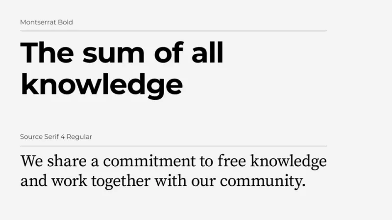
Document the why, not just the what. Brand guidelines that explain the reasoning behind each decision produce more capable practitioners than those that simply list rules. When a designer understands why a particular typeface was chosen—what qualities it embodies, what audience perception it is intended to create—they are better equipped to make sound decisions in unanticipated situations.
Build in a review mechanism for emerging contexts. No brand system, however thoughtfully constructed, anticipates every future channel or format. Organizations that build a structured process for evaluating new contexts and updating their systems accordingly will always outpace those that wait for the next full brand refresh.
The Strategic Imperative
In a marketplace where attention is scarce and differentiation is hard-won, a brand that looks precisely the same in every context is not demonstrating discipline. It is demonstrating an inability to adapt. The most powerful brands in America today are not the most uniform—they are the most coherent. There is a critical distinction between those two qualities, and understanding it is the first step toward building a brand system that genuinely commands market presence.
At Qlab Design, we work with corporate clients to audit existing brand systems, identify where rigidity is limiting performance, and redesign identity frameworks that balance strategic consistency with the flexibility modern markets demand. The goal is never to abandon structure—it is to build structure that works in the real world, not just in a brand guidelines PDF.